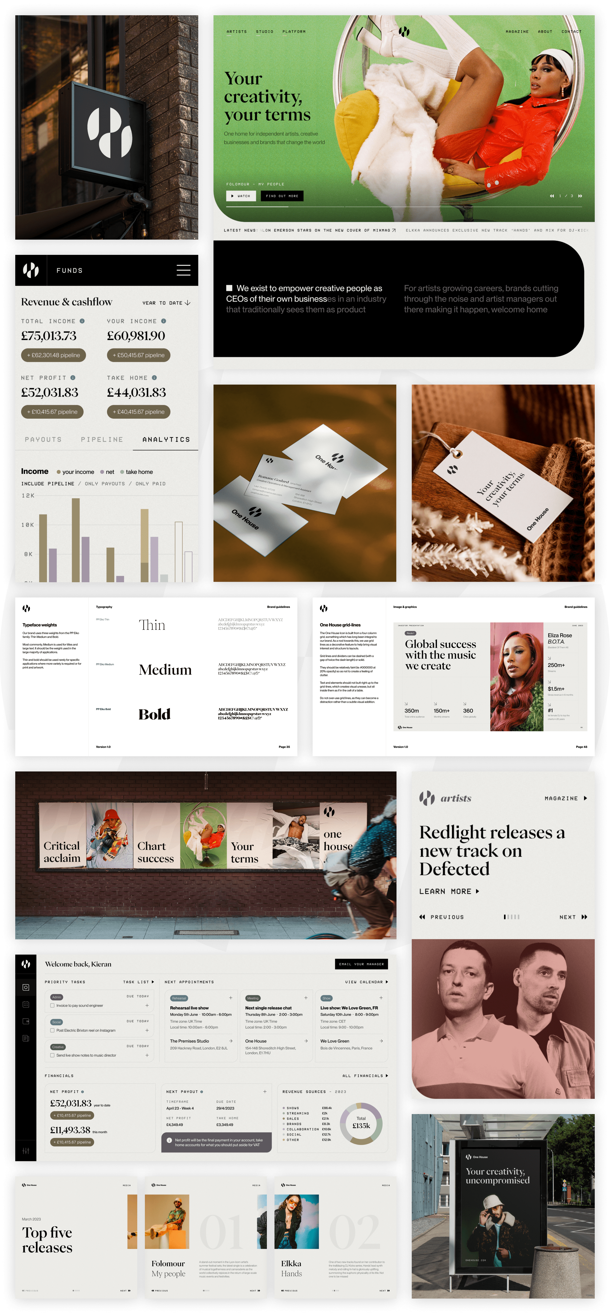

One House asked us to help build and communicate their ground-breaking offering which combines artist management, a label, a creative studio and a software platform.
Positioning
Branding
Web development
Product design
After starting with strategic analysis and positioning exercises to define exactly where One House fits in the market, we then moved into collaborative brand script workshops to refine the proposition and story of the four arms of this fast-growing company.
We realised that One House is all about its roster and network of artists, creators and brands. Making them the heroes was something that remained front of mind as we bought everything together into a cohesive brand architecture. A simplified, more memorable identity, complete brand guidelines and templated assets ensure it's execution remains cohesive and high quality across every channel.
Developing an entirely new site in Webflow, we made sure the One House story is expertly told and that the site feels alive and constantly moving. News carousels, animated hero banners to display the latest releases and a magazine area with features, events, videos and audio stamp their position as an industry authority.
Finally, we worked with their Head of Product to bring the vision of a first of it's kind artist management platform to life. We helped refine the strategy and roadmap before working on the architecture, UX and UI, creating a best in class platform that includes calendar management, financial reporting and automated contracting to make managing artists more simple, effective and profitable.
Eastward Bound are fucking amazing. Process, vision, communication, execution, all of it.

Napper Tandy
CEO - One House
My girlfriend asked me to stop talking about the project. It was so exciting and the results really show that.

Kieran Mallon
Head of Product - One House

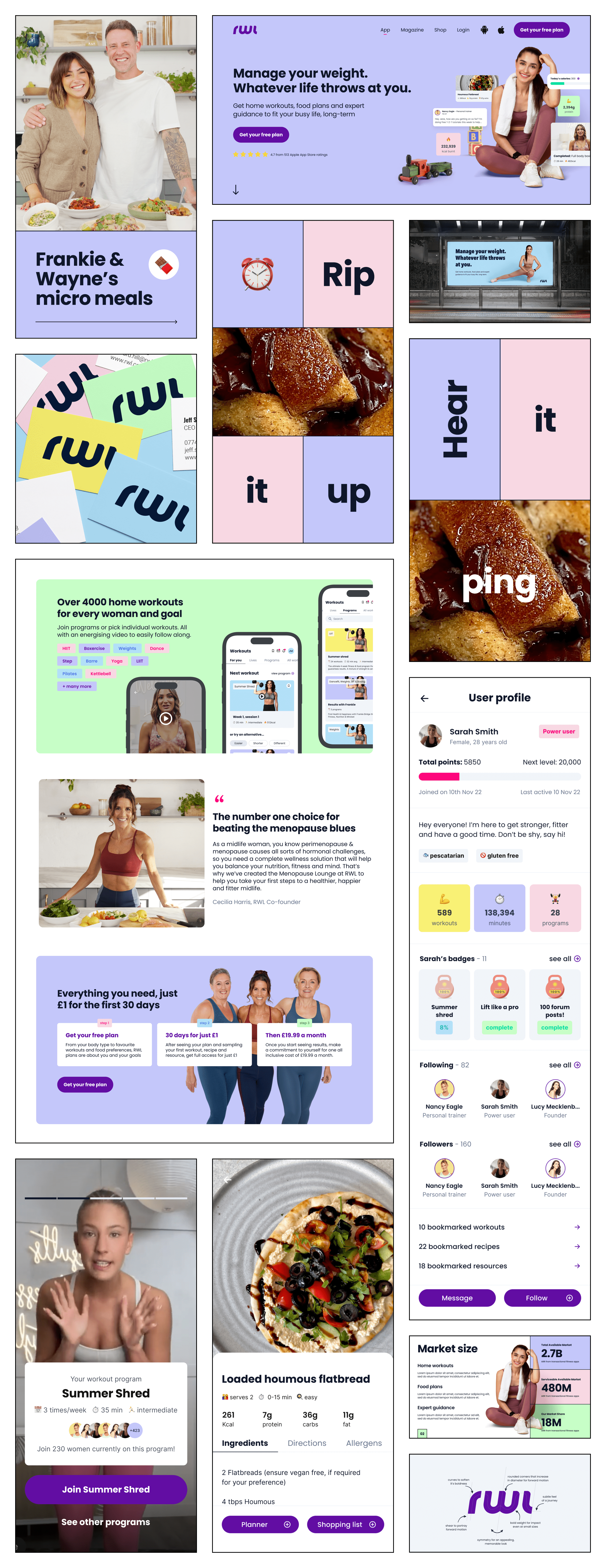
RWL, a leading health and fitness app, came to us struggling with identity issues and retention that were jeapordising their position as the first mover in an increasingly competitive market.
Positioning
Branding
Web design
Product design
After analysing historical data and speaking to their staff and users, we realised RWL had two problems. Firstly, the brand had become muddled, the result of a quickly implemented renaming. Secondly, what they initially thought was poor retention was actually a problem with activating users - people weren't getting far enough to see the immense value of what they offer.
Starting with further research and strategic analysis, we developed an understanding of where RWL could win in the market. We defined their most valuable USPs - a refined demographic focus, guidance of personal trainers and a tight-nit community. Moving into brand and product work, we ensured these were front and center throughout.
We implemented a complete rebrand, refining RWL's brand story and proposition before designing an eye-catching visual identity that is unique in their space. This scaled out into comprehensive brand guidelines and templated assets as well as a new website.
Simultaneously, we worked with their Head of Product and developers to completely redesign the app. We moved from a self-search experience to providing every user with a personalised and guided plan. We implemented enhanced community features, gamification and made sure that we were truly delivering on the promise of a Personal Trainer in your pocket.
We finally have a product we’re proud of, and a unified strategy amongst the team.

Jeff Spires
CEO - RWL
We're already seeing top-line improvements, everything is measurable and on the up.

Edward Hill
Head of Product - One House